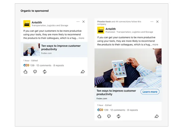
If you've posted a link on LinkedIn recently, you may have noticed that the link preview image that appears in your stream is now much smaller than it used to be.

However, it seems like some posts in your feed still have full-width preview images, but not all of them.
So what's going on?
This is actually part of a change LinkedIn announced a few months ago, which will eventually see all organic posts displaying small link preview images, while sponsored posts will retain the previous UI.

As LinkedIn explains:
“To keep members on LinkedIn and engage with their own comments, we're simplifying the feed by changing image sizes and third-party article link previews for organic posts and sponsored content. When an organic post becomes a Sponsored Content ad, the small thumbnail preview image that appears on your organic post will be converted to a minimum of 360 x 640 pixels and a maximum of 2430 x 4320 pixels.”
In other words, LinkedIn is reducing the size of image previews on organic posts in order to encourage native posting (via LinkedIn articles and direct updates) while also increasing the use of sponsored updates, as once you pay to promote a post you'll once again see a full-width preview image.
LinkedIn further points out that the image preview size change will also take effect whenever a sponsored post is reshared as an organic update.

The update is somewhat similar to how X changed image previews for third-party links last October in an effort to discourage the sharing of external URLs.
As X wants more long-form content to be posted directly to the app, it may change how shared links are displayed, making them less appealing and decreasing referral traffic.
LinkedIn now appears to be taking a similar approach, and users aren't too happy about the change.
As Gartner's Director of Social Media, Christine Thomas, points out, a particularly important difference on LinkedIn is that professionals looking to build a presence within the app aren't necessarily going to be full-time content creators with the time to craft their own updates for each post, so this change will make their updates less visible if they use links, effectively penalizing the way they post and ultimately reducing the overall LinkedIn experience.
And they're less memorable and less engaging in-stream: Small preview images don't attract as many clicks as larger displays. As LinkedIn says, this is intended to “help members stay on LinkedIn.”
But is it a better user experience?
I'm not sure, it seems a bit problematic, or maybe it's just annoying, but either way, LinkedIn is moving forward with the update.
LinkedIn confirmed to SMT that it is continuing to roll out the change, which will eventually apply to all organic posts, including those with external links.
We encourage you to update the way you post on LinkedIn accordingly.


